A Fashion Spread Has a Reading Order
A fashion spread reading order can turn disconnected images into a clear editorial story, using sequence, scale, and pauses to guide each page turn.
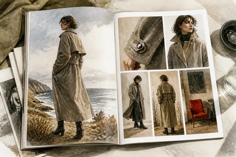
You turn a magazine spread and meet a full-length coat, then a close crop of its cuff, then a model looking beyond the page. Each picture may be beautiful alone, yet the sequence can feel hard to read. A fashion spread reading order is the arrangement that tells the eye where to begin, what to notice next, and when to pause.
When a story feels muddled, the answer is not always another image or a more elaborate concept. Often, each frame needs a clearer job. Think of the spread as a path across pages: scale sets the pace, changes in emphasis create transitions, and blank space can let one image settle before the next arrives.
What should the opening image promise?
A weak opening may give away too much or too little. A tightly cropped detail can offer no clue that it belongs to a fashion story; a crowded scene may ask the reader to decode clothing, pose, setting, and mood at once. In either case, the image makes no clear promise about what follows.
Look at the opener beside the next image, not in isolation. The first frame should offer a readable entry point—a silhouette, a gesture, or a distinct relationship between figure and setting—while leaving room for the sequence to develop. If the opening already contains every major look and visual idea, the next frames may seem like afterthoughts.
Try moving the most revealing full-length image earlier, or reserve it for the point where the story needs a broader view. A cover-like opening is not required. A profile, a partial figure, or a composition with a clear direction of gaze can also invite a second look, provided the next frame answers or complicates it.
Why does the middle of a spread feel repetitive?
Several consecutive images can appear fresh in a contact sheet yet flatten on the page. A common cause is repeated visual scale or pose: each frame shows roughly the same amount of the body from a similar angle, with the clothing occupying the same part of the composition. Small changes in expression may not create enough movement.
Compare neighboring images by asking what each invites the reader to notice. One might establish the silhouette; another could reveal how a sleeve falls when the arm bends; a third might return to the whole look in motion. If two frames perform the same task, keep the stronger one or separate them with a contrasting image.
Contrast need not mean dramatic action. A shift from a distant figure to a close detail changes the reader’s attention; a frontal pose followed by a turned back changes the garment’s visibility. Use such changes with intention rather than alternating scales mechanically. Repeated close-ups can work when repetition marks a pattern, but the choice should feel deliberate.
How can you make a crowded image legible?
When too many visual elements compete, the clothing’s role becomes unclear. A patterned coat against a busy wall, a hand crossing a key fastening, and a prominent prop can pull attention in different directions. The problem may lie less in the photograph than in its neighbors: a frame that works as a brief accent can become confusing if another equally dense image follows.
Name the image’s intended subject in a few plain words: “the long line of the coat,” “the layered collar,” or “the stance.” Then check whether its strongest visual feature supports that subject. If not, consider a cleaner neighboring frame or a tighter edit rather than relying on a caption to explain the picture.
Say an editor has selected two portraits featuring a sculptural jacket and one frame where a bright chair competes with its shape. The editor places the chair image between two quieter portraits. The expected result is a brief visual detour that does not displace the jacket as the sequence’s main subject. If the chair still dominates when the images are viewed in order, the editor can remove that frame instead.
How do page turns carry the story forward?
A page turn creates a natural pause, but it can feel like a break when the next spread starts without a visual or emotional connection. This can happen when images are arranged by garment alone: all the coats together, then all the dresses. The categories are tidy, but the reader may not sense why one group leads to another.
Look for a bridge between the last image on one spread and the first on the next. It might be a recurring color, a direction of movement, a related posture, or a shift from a contained setting to an open one. The connection need not repeat every detail; a modest echo can make the next page feel like a continuation with a new emphasis.
Check the actual page geometry, too. A face, hand, or important garment feature near the gutter can be swallowed by the fold or made awkward by the binding. Move the image, crop, or layout so the central information remains visible. The reader should encounter the intended pause, not an accidental interruption.
When does a spread need a pause?
Not every gap needs filling. A quiet page, a broad margin, or a single image with room around it can give a striking silhouette time to register. A pause works best when the preceding sequence has established a subject or rhythm; otherwise, empty space can look like a missing piece.
Consider what the reader has just seen and what the next image contributes. If the previous frame carries a strong gesture or unusual proportion, a restrained layout may let that impression linger. If the following frame introduces a new look or setting, the pause can make the transition easier to notice. A spread crowded with small images may instead need subtraction: removing one frame can clarify the others more than adding decorative space around them.
It is not worth forcing every spread into a fixed pattern of wide image, detail, and empty page. That formula can make distinct photographs feel interchangeable. Let the pictures set the rhythm, then adjust their order and scale to make the sequence readable.
Which sequencing questions help solve common problems?
How many images should appear on a fashion spread?
There is no fixed count that suits every spread; the choice depends on the images’ distinct roles and the space available. Remove a frame that repeats its neighbor’s visual information, then check whether the remaining sequence still feels complete.
Should a fashion editorial begin with a full-length photograph?
Not necessarily, but the opening should offer a clear point of entry, such as a recognizable silhouette or an intriguing gesture. Choose a full-length image when the whole look is the most useful first impression.
How do you place a close-up in the sequence?
Put it where the detail answers a question raised by a broader image, or where it creates a deliberate change of pace. A detail with no relationship to its neighbors can feel decorative rather than meaningful.
What if one image feels too strong for the rest?
Give it more space, move it to a point where the sequence can build toward it, or pair it with a quieter frame. If it overwhelms the clothing or makes every later image seem weaker, consider leaving it out.
How can you review the reading order before publication?
Arrange the selected images as simple thumbnails in page order, even if the full layout is not ready. Include the gutter and page turns: a sequence that works in a row may feel different when divided across spreads. For each image, ask what it establishes, changes, or lets the reader notice.
- Check whether the opening image has a clear point of entry; if it does, keep it in place, but if it does not, try a frame with a more legible silhouette or gesture.
- Check whether neighboring frames repeat scale, pose, or emphasis; if they do, keep the stronger image and move or remove the other, but if they do not, preserve their contrasting roles.
- Check whether each close detail relates to a broader view; if it does, place it near that view, but if it does not, choose a different detail or cut it.
- Check whether the page turn has a visual echo or purposeful change in mood; if it does, retain the transition, but if it does not, move an image that links the two spreads.
- Check whether the gutter or margins hide an important garment feature; if they do, adjust the crop or placement, but if they do not, leave the layout unchanged.
- Check whether a frame repeats information without changing the pace; if it does, remove it or replace it with a contrasting image, but if it adds a distinct role, keep it.
For a worked example, imagine an editor arranging three hypothetical images: a full-length coat portrait, a cuff close-up, and a second coat portrait with the model turned away. The editor first opens with the full-length portrait to establish the silhouette. Next, the cuff close-up makes the sleeve detail visible; the turned-away portrait follows to show how the coat reads from behind. If the close-up interrupts the flow when the three thumbnails are viewed in order, the editor moves it after the second portrait, where it can act as a deliberate pause. The resulting decision depends on what the sequence needs: an early material detail or a later change of pace.
Read the spread again at its intended size. If it has a clear beginning, a developing middle, and places where the eye can rest, the fashion spread reading order is doing its work. A surprise or interruption can give an editorial character, provided the reader can still tell what the next image asks them to see.